Canvas Art Prints: A Guide to Color Schemes and Matching
Share
Canvas Art Prints: A Guide to Color Schemes and Matching
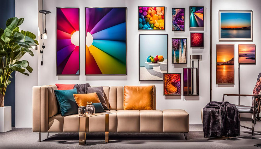
Choosing the right color scheme for your canvas art prints can transform a room from ordinary to extraordinary. With endless possibilities, selecting the perfect palette that complements your decor can be both exciting and daunting. Here’s a comprehensive guide to help you navigate color schemes and achieve a harmonious look with your canvas art prints.
1. Understand Your Space
Before selecting colors, consider the existing color scheme of your room. Identify the dominant hues in your furniture, walls, and accessories. This will help you choose a canvas print that either complements or contrasts with these elements. For instance, if your room features neutral tones, you might opt for vibrant, bold colors in your art to create a striking focal point.
2. Consider the Mood
Colors can evoke different emotions and set the mood of a space. For a serene and calming atmosphere, opt for cool tones like blues, greens, and grays. These colors work well in bedrooms or bathrooms, creating a tranquil environment. On the other hand, warm colors such as reds, oranges, and yellows can add energy and vibrancy, making them ideal for living rooms or dining areas.
3. Complementary Colors
Using complementary colors, which are opposite each other on the color wheel, can create a striking visual contrast. For example, pairing a canvas print with shades of blue and accents of orange can produce a dynamic and engaging effect. This approach is perfect for making a bold statement and drawing attention to your artwork.
4. Analogous Colors
For a more cohesive and soothing look, consider analogous color schemes. These colors are next to each other on the color wheel, such as blue, teal, and green. This creates a harmonious effect and works well in spaces where you want a unified and calming feel. Choosing canvas art that incorporates these colors will blend seamlessly with your room’s decor.
5. Monochromatic Schemes
A monochromatic color scheme involves using variations of a single color. This approach can create a sophisticated and streamlined look. If you have a monochromatic room in shades of gray, a canvas print in varying tones of gray can add depth while maintaining a cohesive aesthetic.
6. Pop of Color
If your room has a neutral base, you can use canvas art prints to introduce a pop of color. A single vibrant artwork can act as a focal point, adding interest and personality without overwhelming the space. This method is particularly effective for highlighting an area or creating a visual anchor in the room.
7. Testing and Placement
Once you’ve selected your color scheme, consider testing the art prints in your space. Use digital tools or samples to visualize how different colors will look against your walls and furniture. Placement is also crucial; consider the scale of the canvas and its relation to other elements in the room. Large prints can dominate a space, while smaller ones might need to be grouped together for impact.
Conclusion
Selecting the right color scheme for your canvas art prints is key to enhancing your home’s decor. By understanding your space, considering the mood, and choosing the appropriate color schemes, you can create a visually stunning environment that reflects your personal style. Whether you opt for bold contrasts or harmonious blends, your choice of canvas art will be a testament to your creativity and design sensibility.
Blog: Canvas Art Prints: A Guide to Color Schemes and Matching


